Industry
E-commerce
Role
Senior UX/UI Designer
Pet food, delivered.
As the Senior UX/UI Designer on the web team, I lead end-to-end experience design across our e-commerce site. My focus is on optimizing user journeys, improving conversion, and building scalable design systems. I partner closely with Product, Engineering, Growth, and Creative to design, iterate, and launch experiences that elevate usability and drive measurable business results.

Explore my work
Selected Projects
Project 1
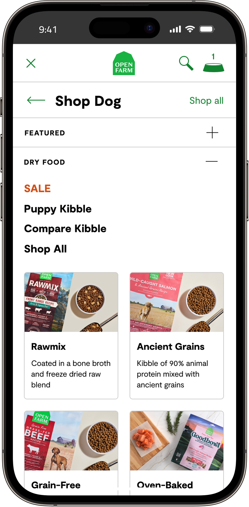
Navigation Redesign
I led the redesign of our site navigation to improve product discovery, simplify decision-making, and reduce friction across mobile and desktop. This project focused on restructuring content, refining interaction patterns, and aligning the experience with user behavior and business priorities.
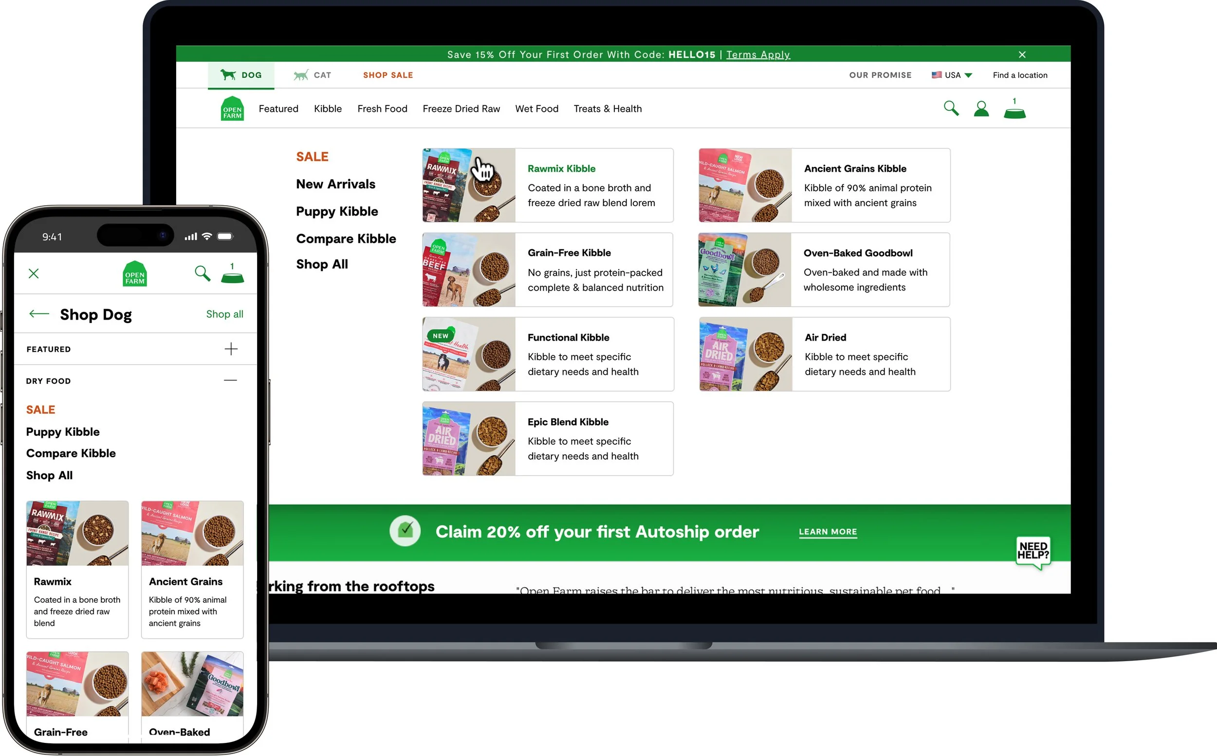
Problem
Customers often feel unsure navigating our growing product lines—especially new pet parents. With many kibble types and naming conventions, it’s hard to know where to start, leading users to default to familiar options instead of the best fit. This uncertainty also drives a high volume of support inquiries.
“I’m not sure where to start. There are so many types of kibble… I don’t really know the difference or which one is right for my dog.”
Pet parent

“I want to pick the best food for my pup, but there are so many options. I’m not confident I’m choosing the right one without help.”
Pet parent
Research & Discovery

Click Data w/ Hotjar
-
Sharp drop-off after the first column.
Marketing items underperform in clicks.
Strong interest in “Puppy” despite its lower placement.
Strongest clicks occur for account holder to log in
-
One oversized dropdown presents too many options at once.
“New Arrivals” sits too low in the hierarchy to be discoverable.
Dog shoppers favor dry food; cat shoppers prefer wet food.
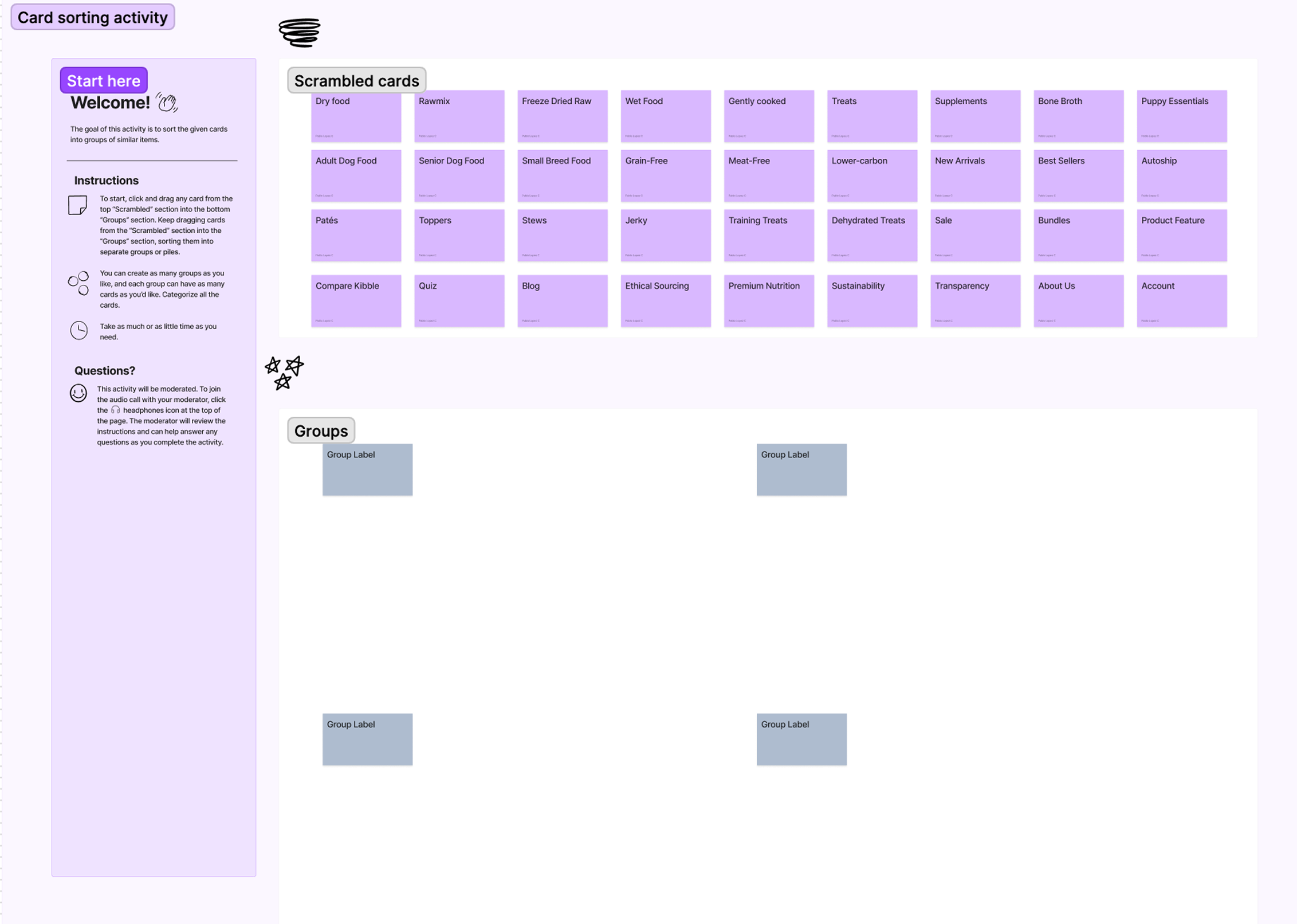
Card sorting
-
Card sorting helped us understand how users naturally group products and categories. By observing how participants organized kibble types, product lines, and feeding needs, we identified clearer naming patterns and a more intuitive navigation hierarchy.
-
Noticed users organized primarily via dry food & wet food
Some products fell in grey area and provided insight into possible categorizing seperately
Noticed groups seperated by breed/lifestage
some groups categorized by “diet type'“

Heuristic Analysis
-
Dog shoppers are much different than cat shopper. These personas have different preferences and right now they are not uniquely different to reflect.
There is a much larger SKU amount for dogs and this negatively paints cat to be bearish and lacking in product
How do we create unique dog/cat parent experiences that feel like separate worlds?
-
Explore separating sub-categories into their own dropdown for easier scanning.
Highlight the growing interest in “Gently Cooked” to better meet shopper demand.
Improve hierarchy to surface key items like “New Arrivals” and “Best Sellers” in line with e-commerce best practices.
User Testing:
Two Navigation Concepts
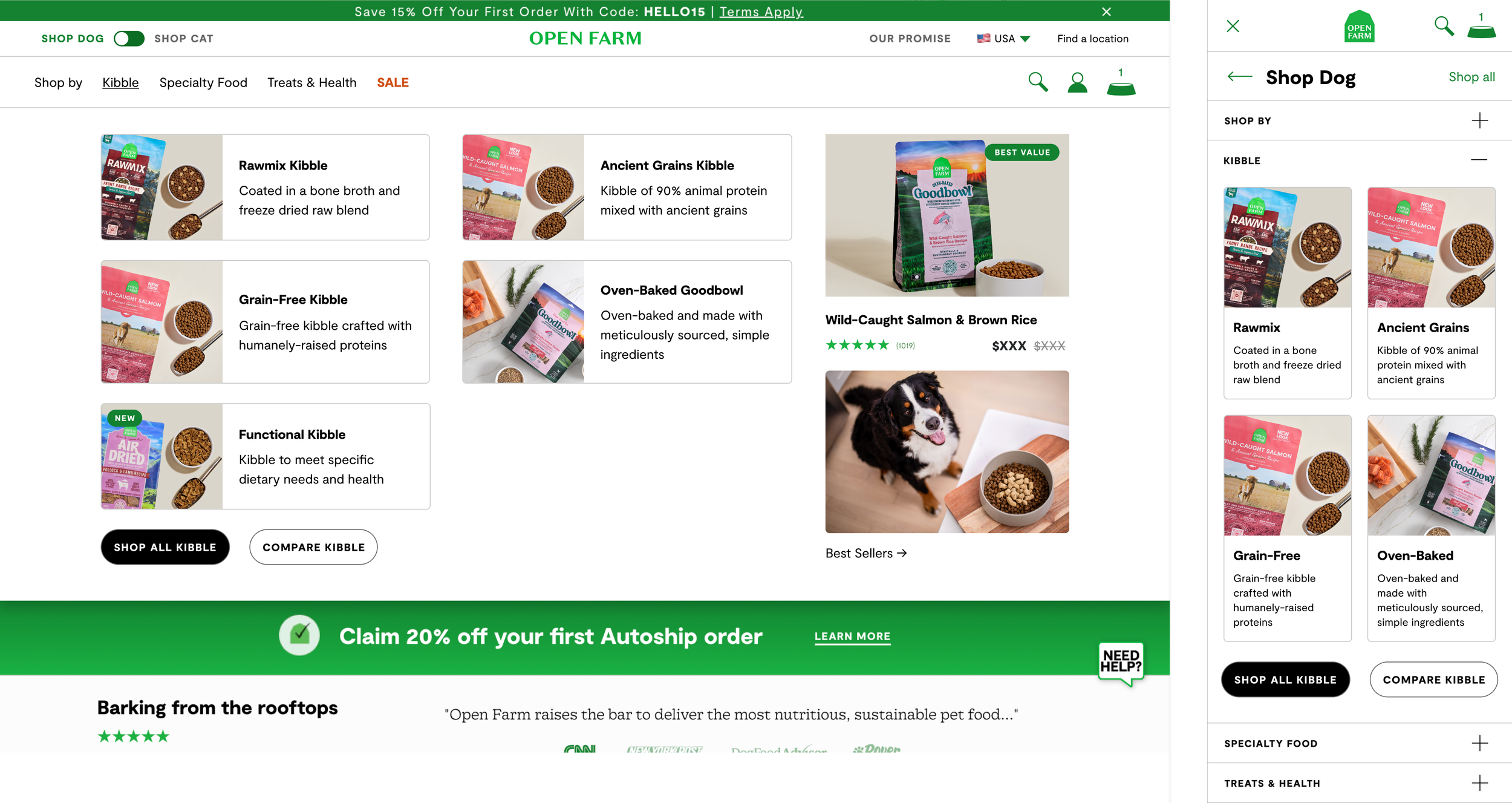
Concept A
Visual, Category-Led Navigation
A visually rich layout that surfaces all Pet food types upfront with visuals and added context, helping users browse by product line with minimal friction.
Key Insights
Users quickly grasped the differences between kibble types.
This layout reduced uncertainty and encouraged starting in a specific category instead of defaulting to “Shop All.”
New users benefitted from getting a little more help guiding their journey
Users overwhelmingly preferred Concept A and felt it presented the brand as more premium.

Concept B
Streamlined, Text-First Navigation
A simplified, structured menu that improves clarity and helps users quickly find the right product category.
Key Insights
Users often questioned the meaning of product line names (“What is Rawmix?”).
The lack of visual context led to hesitation and more reliance on “Shop All” although it was a little hard to see
Users typically wanted to click compare all kibble to get more information
Users quickly grasped the species toggle which changes the navigation items
Final Design & Launch
Refining the Chosen Direction
After selecting Concept A, we refined the hierarchy, simplified category labels, and optimized visual cues for both desktop and mobile to support faster decision-making.
Implementation & Handoff
Delivered responsive UI, component specs, and interaction notes to Engineering. Collaborated closely during development to ensure accuracy across breakpoints and preserve the intended user flow.


Early Results
Increased engagement with key product categories
Fewer “Shop All” fallbacks, indicating higher user confidence
Improved clarity and pathing on both desktop and mobile
Reduction in navigation-related support questions
No drop in click through rates and we are seeing users navigate primarily to specific collections on new sessions
Project 2
•
Meal plan quiz
•
Project 2 • Meal plan quiz •
Project 2
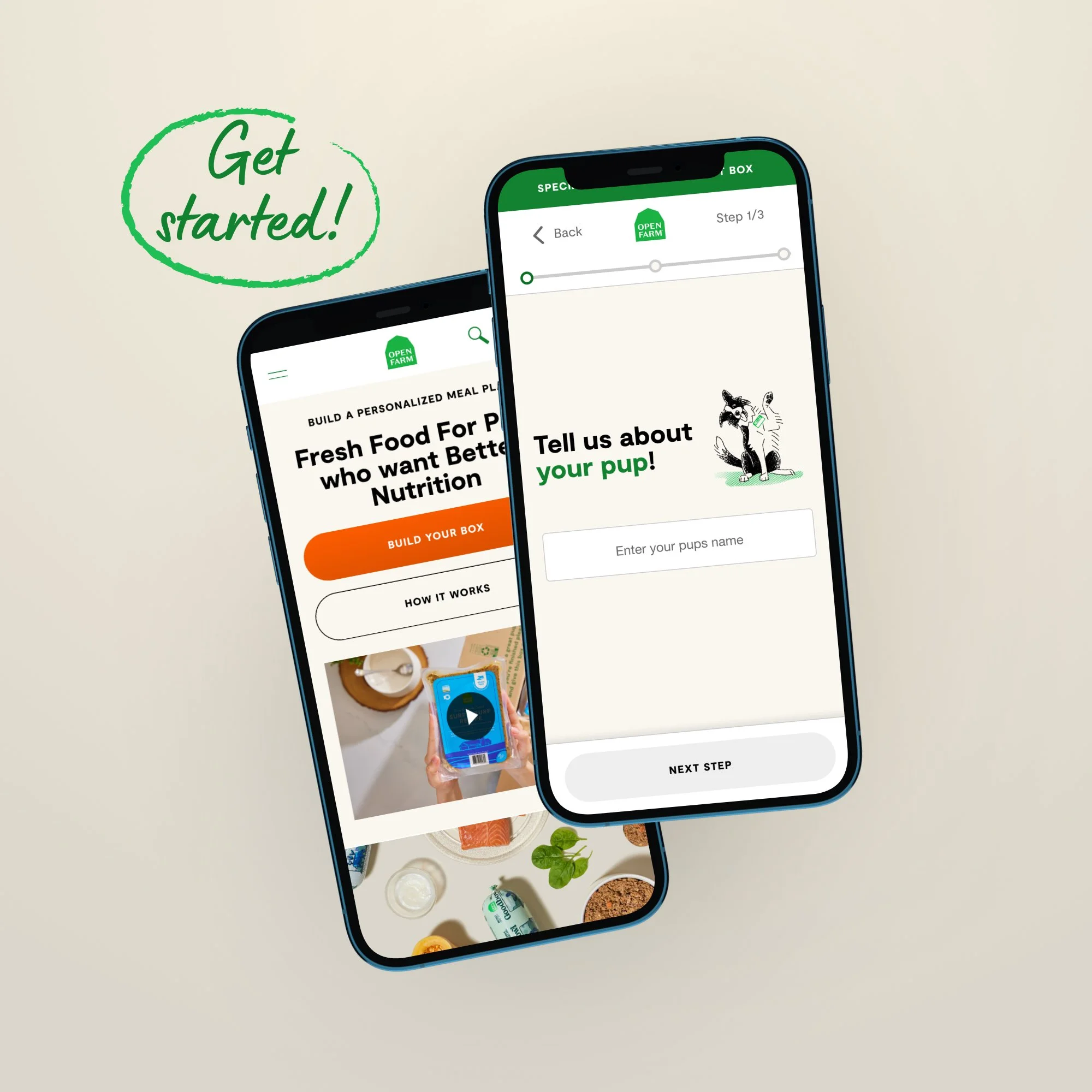
Dog Food Meal Plan Experience
I led the design of a personalized meal plan flow to help customers discover the right Gently Cooked recipe for their dog. The goal was to reduce uncertainty, simplify decision-making, and guide pet parents toward products that best fit their dog’s needs.

Project Brief
The business aimed to establish a stronger presence in the rapidly growing Gently Cooked dog food market—an emerging space dominated by brands like The Farmer’s Dog. To stay competitive and capture more subscription-based revenue, we needed a guided experience that helped pet parents understand the value of our premium, ethically sourced recipes.
What we needed to solve
Increase visibility and adoption of Gently Cooked
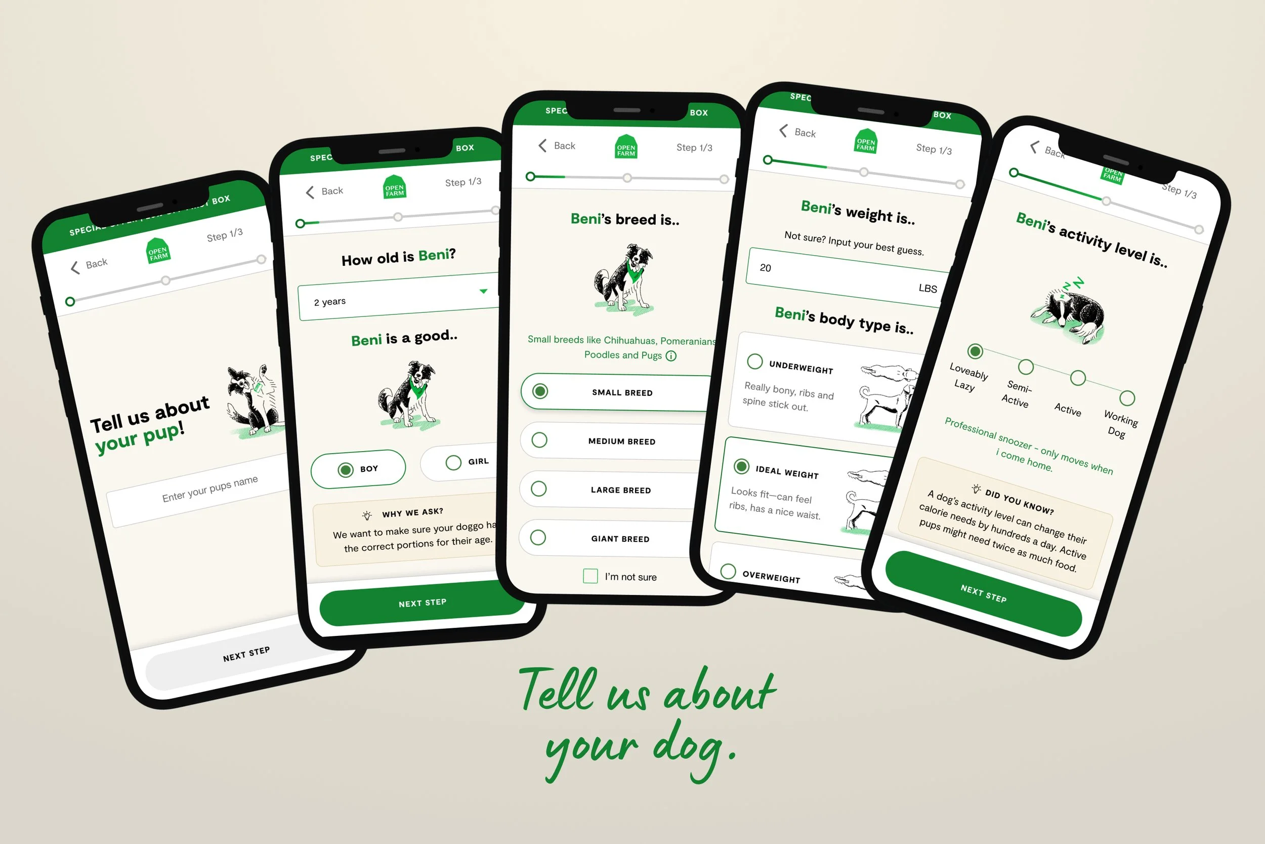
Provide personalized meal recommendations based on biometrics
Create a quiz-like experience that encouraged subscription
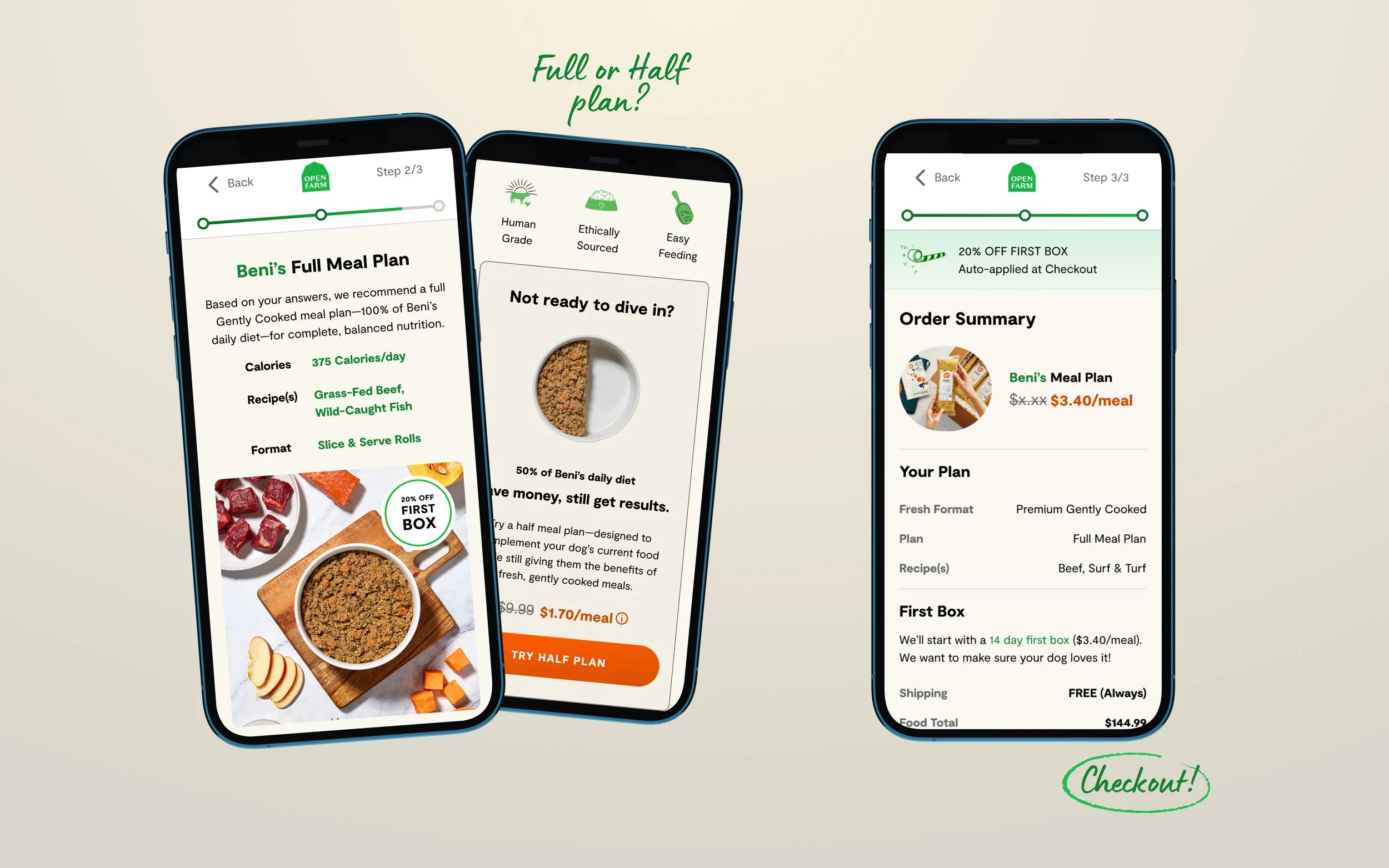
Offer three different formats to create more tailored plans.

Research & Discovery
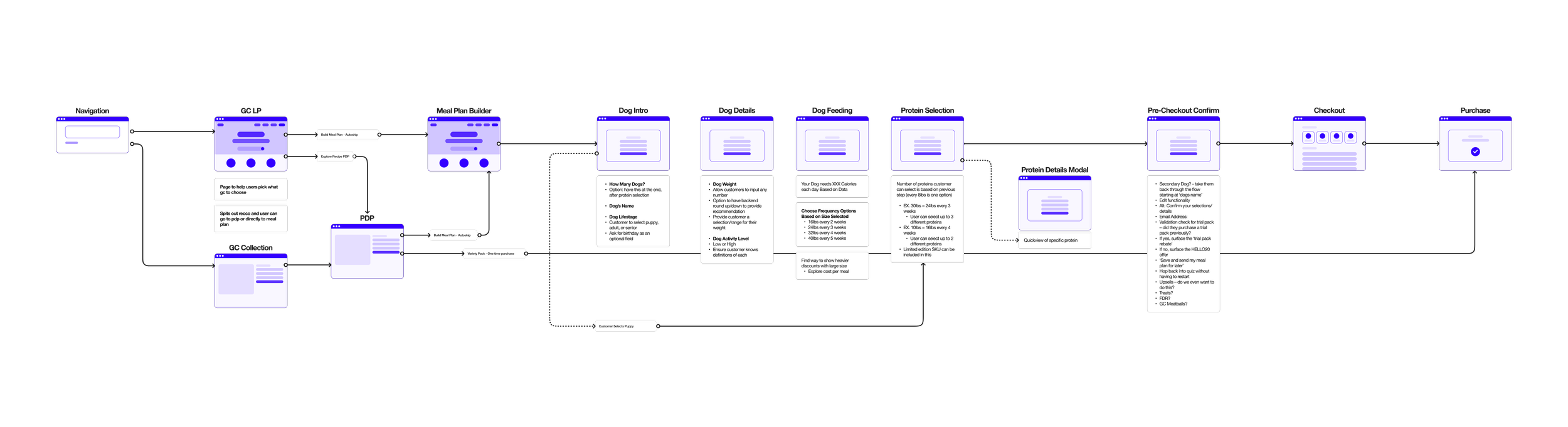
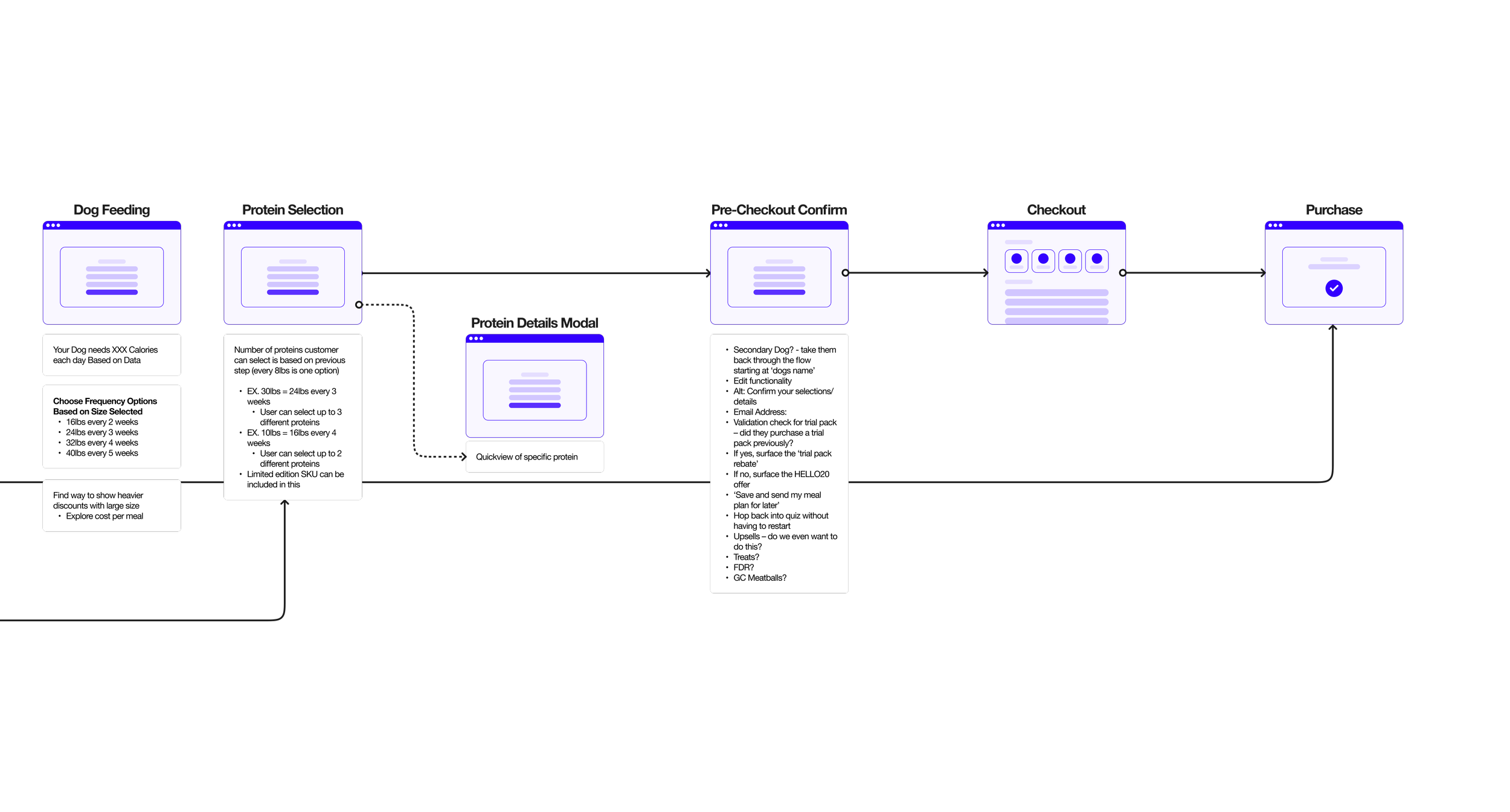
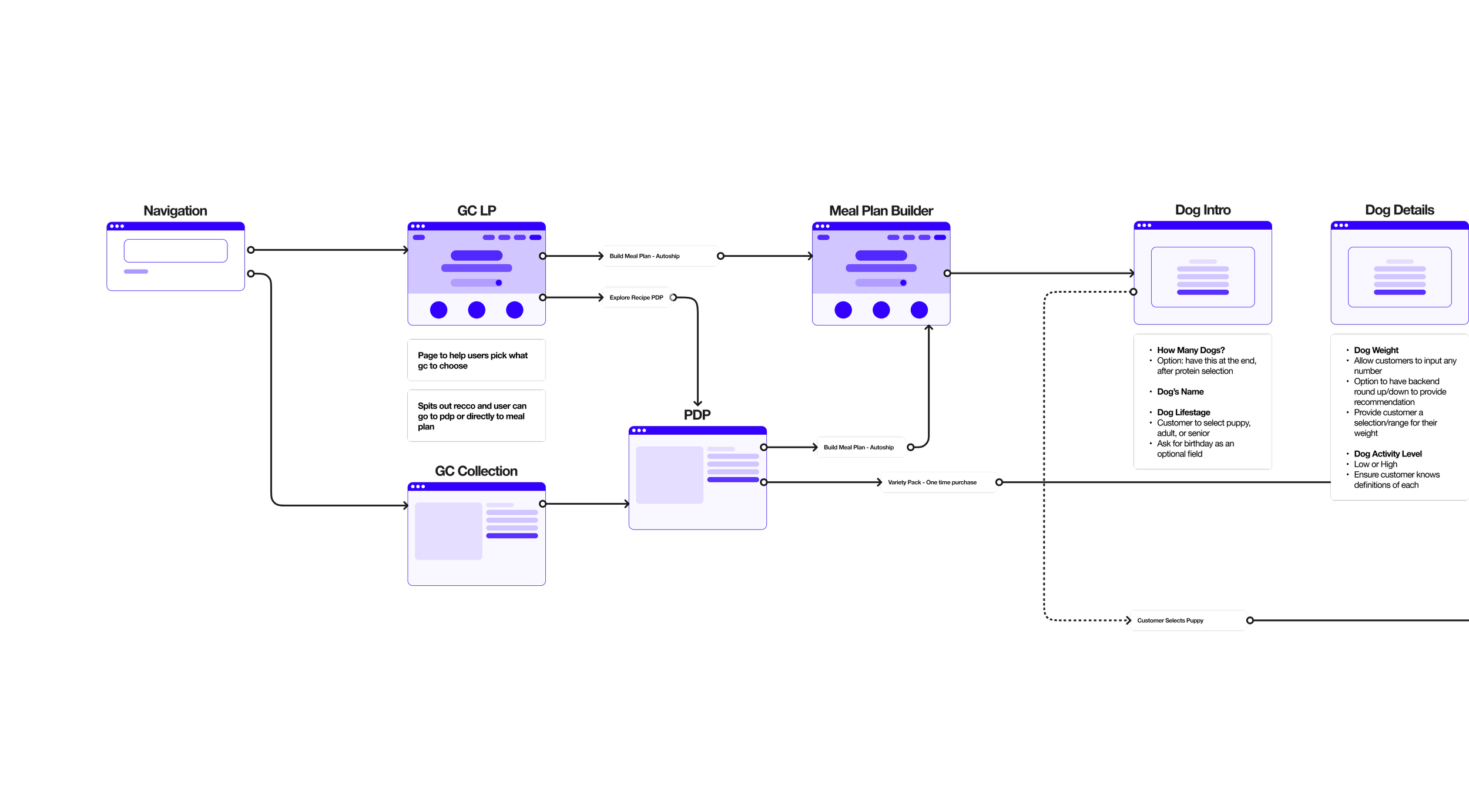
Mapping the User Flow With Cross-Functional Teams
Collaborated with Product and our nutrition team to map the meal plan user flow.
Brought in a veterinary specialist to validate required questions and ensure the flow was medically sound.
Defined the MVP question set to balance accuracy, user effort, and business goals.
Built a detailed Figma user flow to align the team on logic, steps, and decision points.
Wireframing & Prototyping
I explored multiple ways to structure the quiz steps, balance required inputs, and present educational content without overwhelming users. Early iterations focused on simplifying the question flow, reducing friction, and establishing a premium look and feel aligned with our Gently Cooked brand story.
Optimizing question order for clarity
Adding contextual tooltips and microcopy
Testing layouts that minimized cognitive load
Ensuring the mobile experience felt lightweight and quick
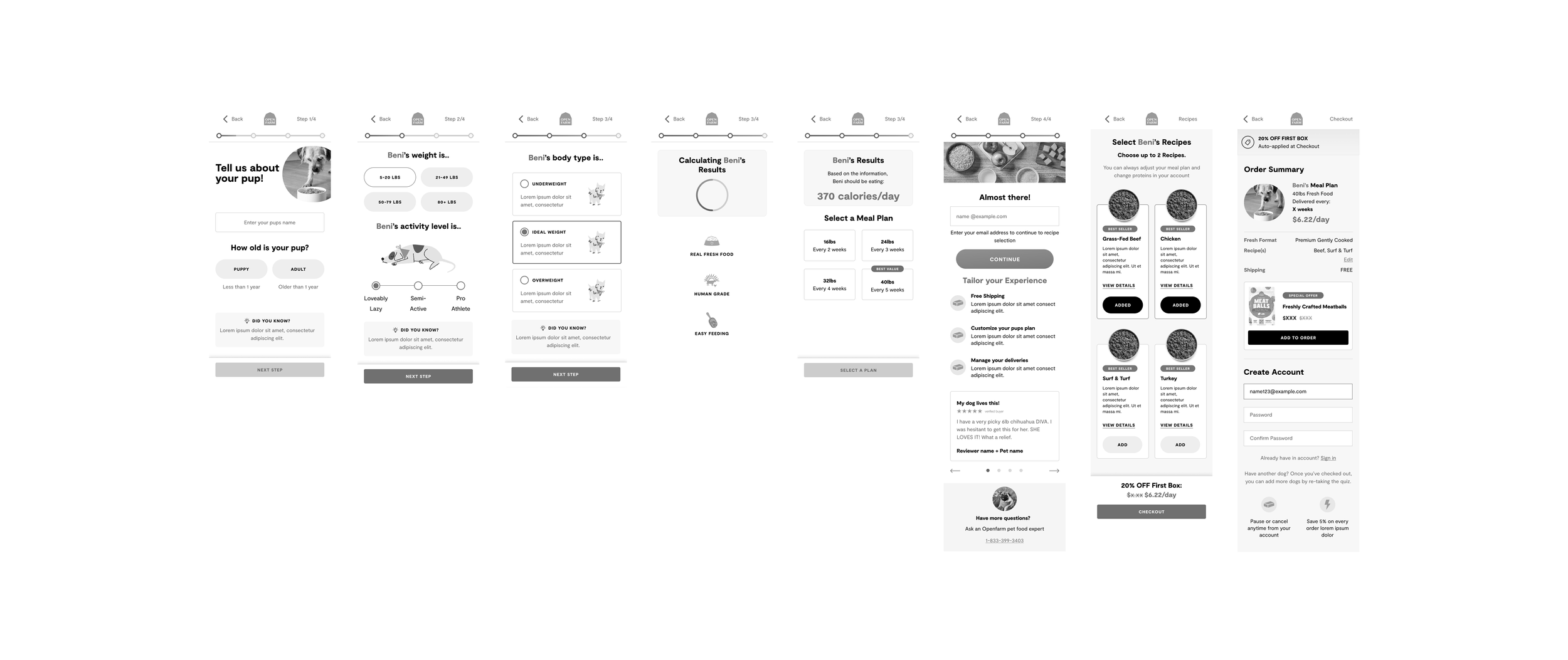
Wireframe v1

Wireframe v2

Wireframe v3
UI Handoff & Implementation
After finalizing the high-fidelity designs, I prepared detailed component specs, spacing rules, interaction notes, and responsive behaviors to ensure the quiz experience translated accurately across breakpoints. Throughout handoff and build, I focused on preserving the premium visual tone of the Gently Cooked line—reinforcing trust, quality, and value in every step of the quiz.


Project 3
•
Product Page Design
•
Project 3 • Product Page Design •
Project 3
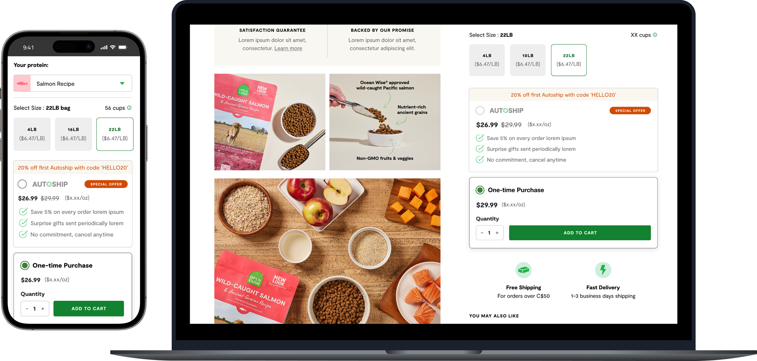
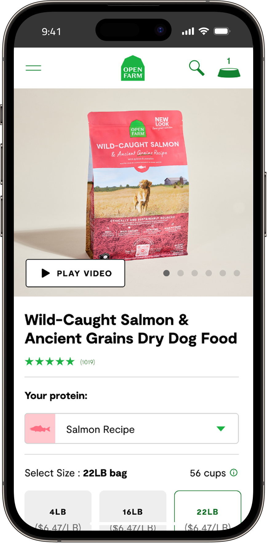
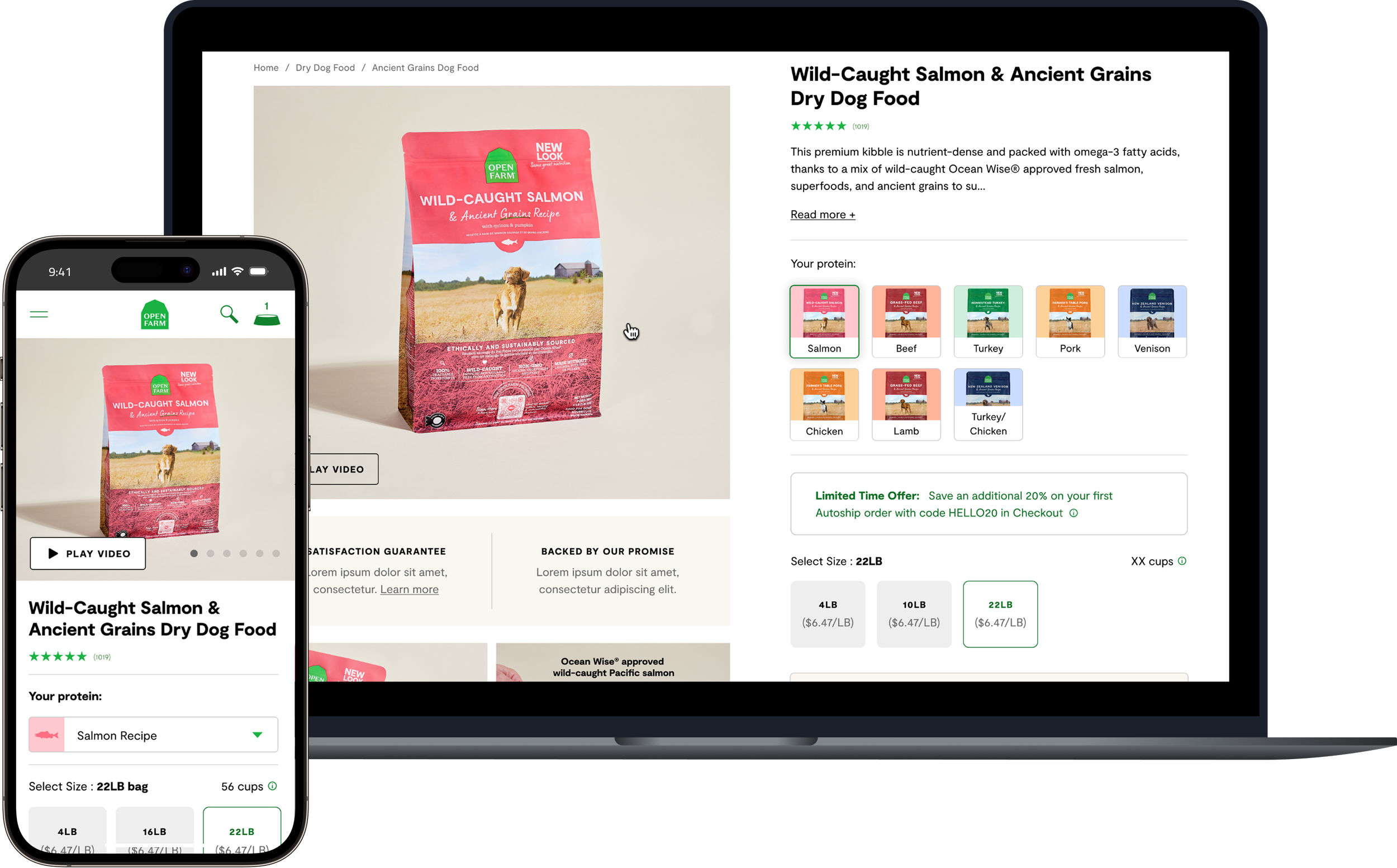
Product Page Update
I led the redesign of our Product Detail Page (PDP) to improve clarity, streamline decision-making, and support both one-time and subscription purchasing. The goal was to rethink the buy box, content hierarchy, and overall page flow to better guide users toward confident purchase decisions.
Previous State Analysis
To identify opportunities for improvement, I reviewed Hotjar heatmaps, scroll behavior, and click patterns across desktop and mobile. I paired these insights with Google Analytics pathing data to understand how users moved between PDPs, collections, and the broader shopping journey.
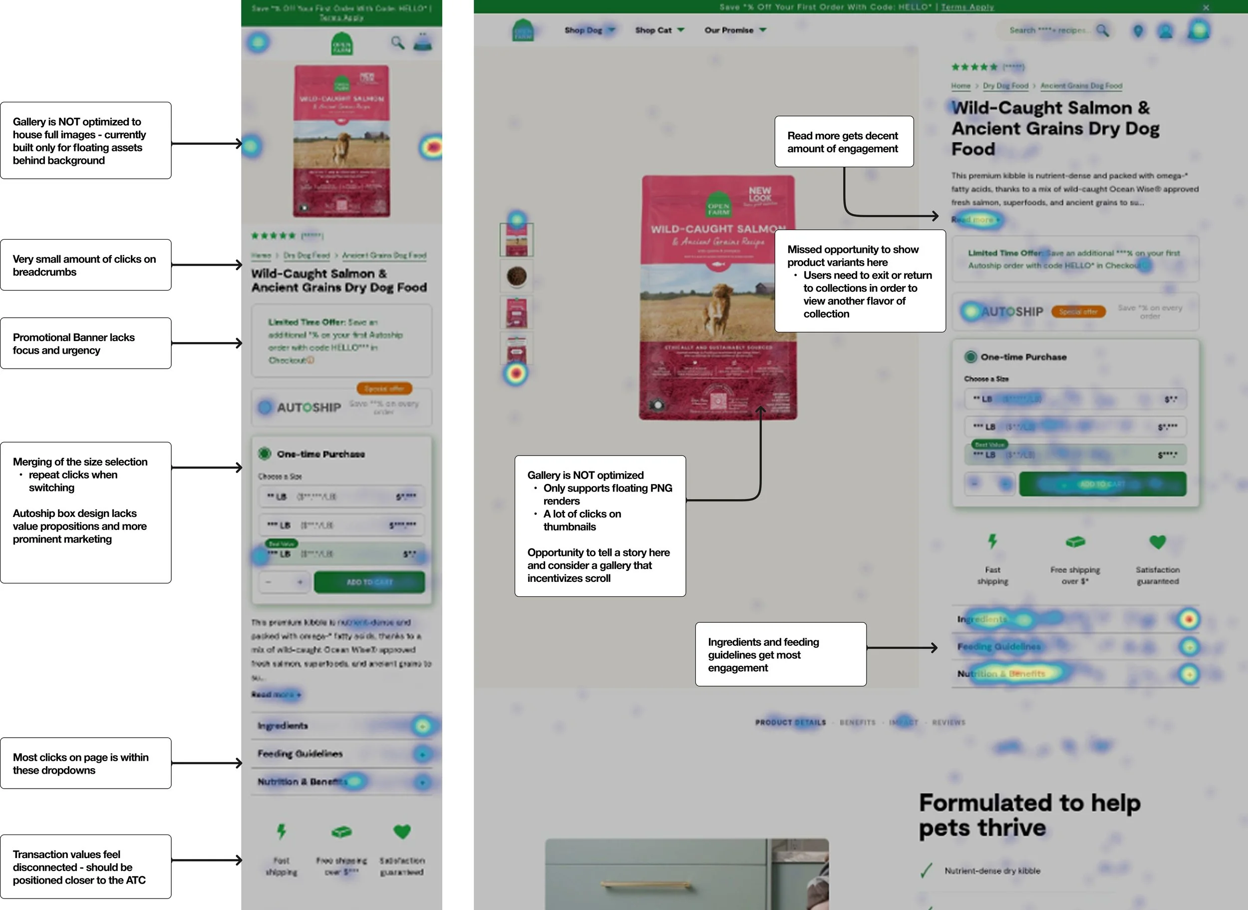
1. High friction when exploring product variants
Users frequently moved back and forth between PDPs and collection pages. Without a variant selector on the PDP, customers had no way to view different protein options within the same product line — creating unnecessary loops and decision fatigue.
3. Buy box hierarchy needed clarity and polish
Autoship wasn’t prominent, value props were missing, and size and purchase type were nested together, creating repeat clicks. Transaction details sat too far from ATC, and high-value content like Ingredients and Feeding Guidelines was buried below the fold.
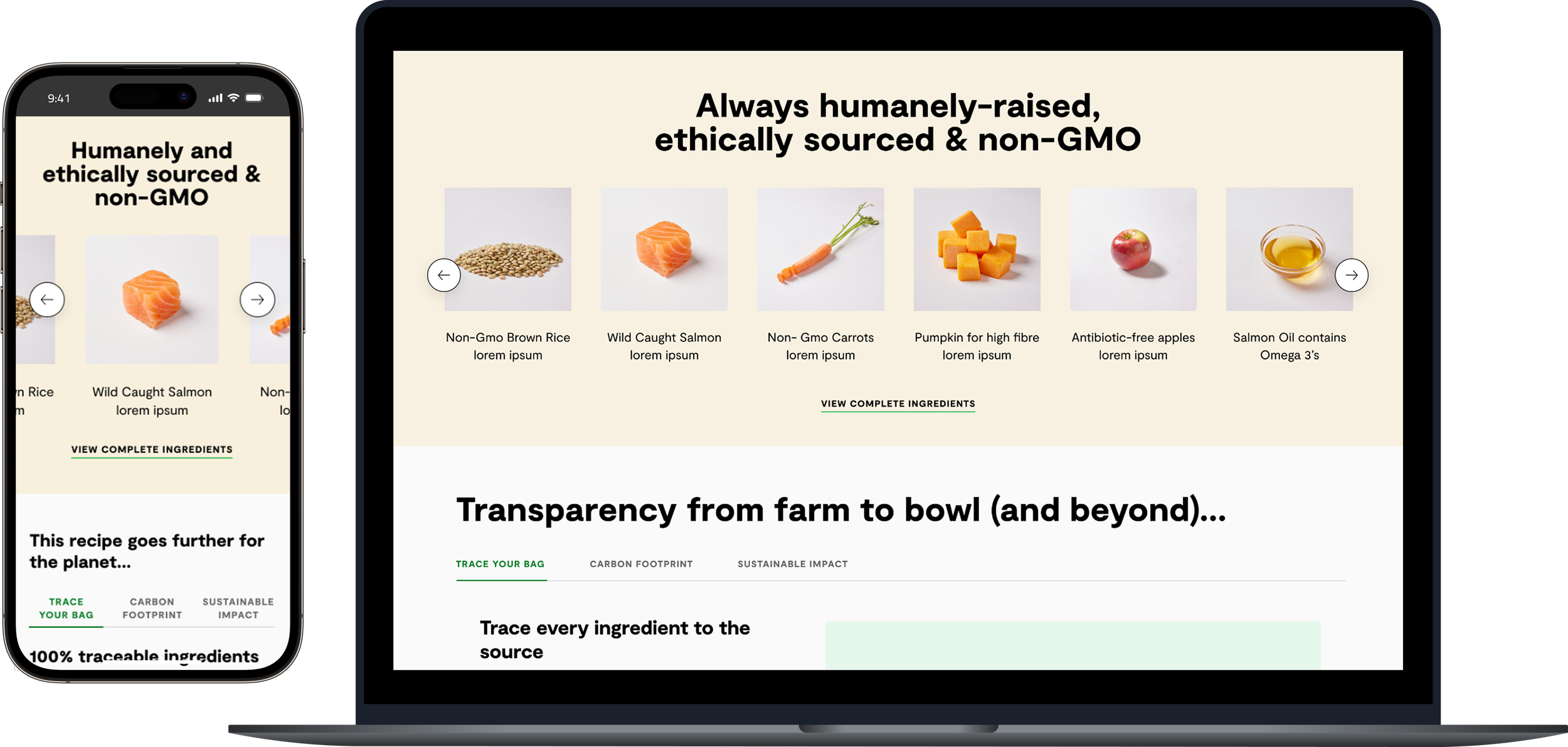
2. Gallery limitations restricted storytelling
The existing gallery only supported floating PNG renders. This meant lifestyle imagery couldn’t be used (it clashed with the eggshell background). The gallery lacked depth and visual interest overall.
4. Key content lived below the fold
Ingredients and Feeding Guidelines received the most engagement, but were buried in accordion sections. This suggested users were working harder than necessary to find critical decision-making content.
Phased Rollout & Iterative Improvement
-
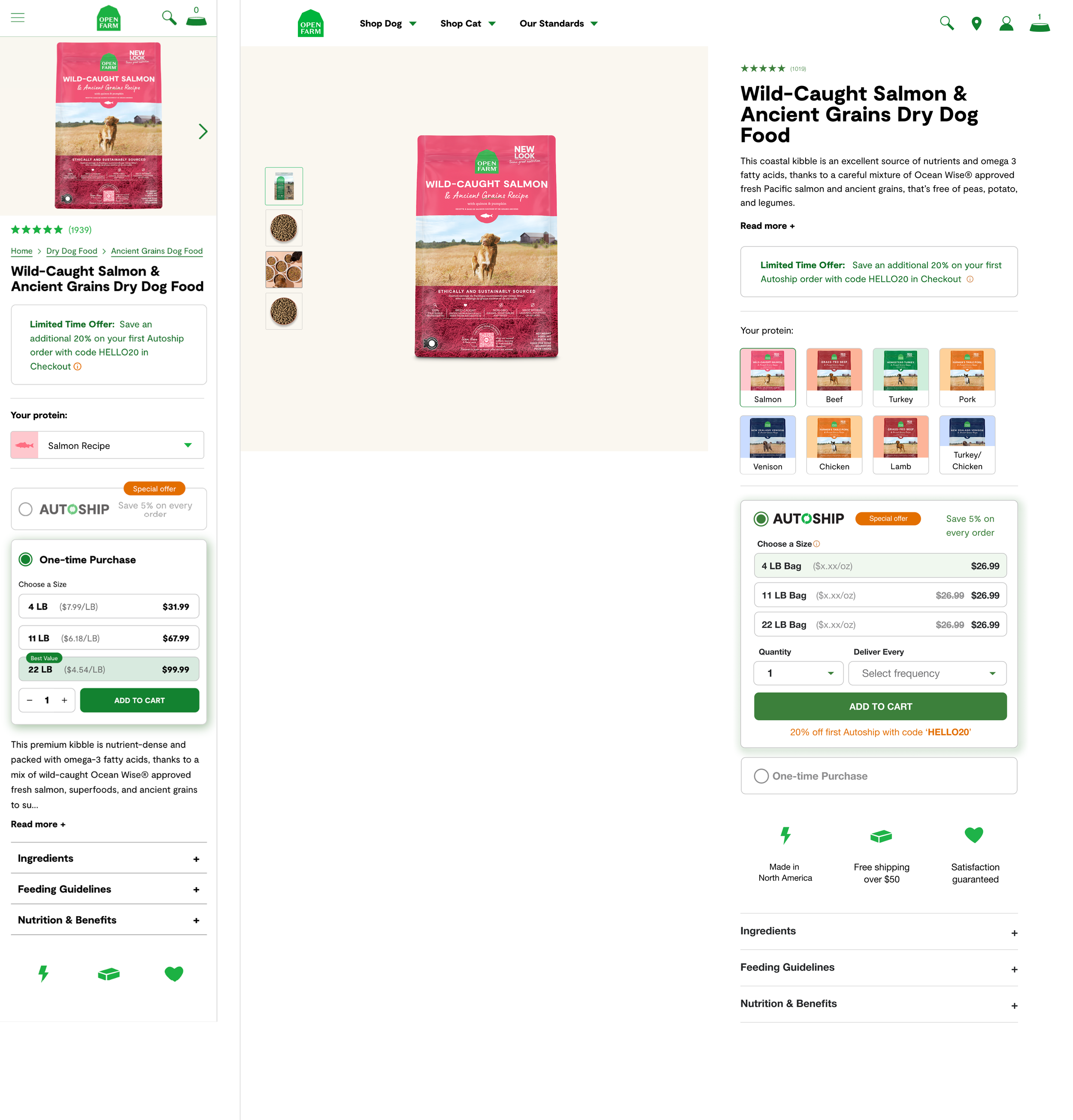
Phase 1 — Improving Product Exploration
Key Updates
Added a visual variant selector using thumbnail images to help customers quickly compare proteins without leaving the PDP.
Optimized for mobile with a dropdown-style selector to prevent excessive scrolling.
Established the foundation for clearer navigation within a product line.
-
Phase 2 — Restructuring the Buy Box & Content Hierarchy
Key Updates
Separated size selection from purchase type, reducing repeat clicks and improving clarity.
Redesigned the Autoship module with stronger value props, visual hierarchy, and clearer savings messaging.
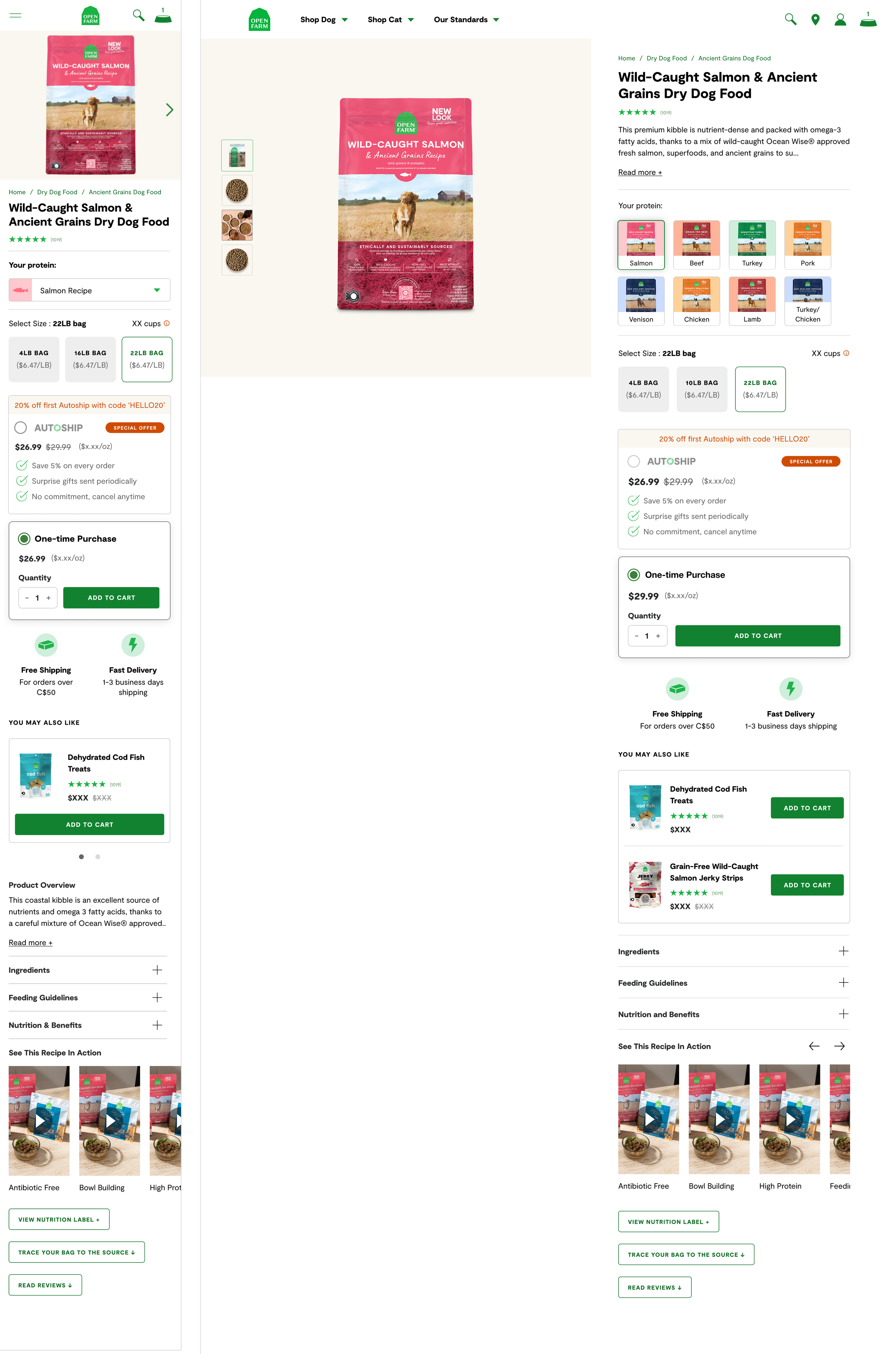
Introduced cross-sell recommendations, enabling customers to add treats, supplements, and broth directly from the PDP (aligned with eCommerce best practices).
Added social video content (“See This Recipe in Action”) to bring more storytelling and leverage existing marketing assets.
-

Phase 3 — Elevating the Visual Story & Premium Feel
Key Updates
Rebuilt the gallery with a collage-style layout that mixes lifestyle images, product shots, and detail close-ups—encouraging scrolling and supporting a more premium brand experience.
Added value props and a video CTA directly in the hero image to highlight quality, trust, and product benefits upfront.
Finalized the overall visual language and content flow for consistency across product lines.
Outcome
Across all phases, we saw increased engagement with variants, stronger interaction with Autoship, and higher scroll depth through the gallery and content sections. The phased approach allowed us to validate improvements incrementally while reducing risk and ensuring quality across categories.